
Workspace UX design
Design a Collaborative Tool

Background
An intelligent KPI troubleshooter | Collaborative Analytics | Actionable Insights
Kubit AI
is an intelligent KPI Troubleshooter and a collaborative tool built for PMs and data analyst in small to medium-sized businesses to quickly identify the root cause of data anomalies together and make informed decisions with efficiency. It primarily solves the problem businesses face today when they try to analyze and compare their data from many different dimensions simultaneously.


Story
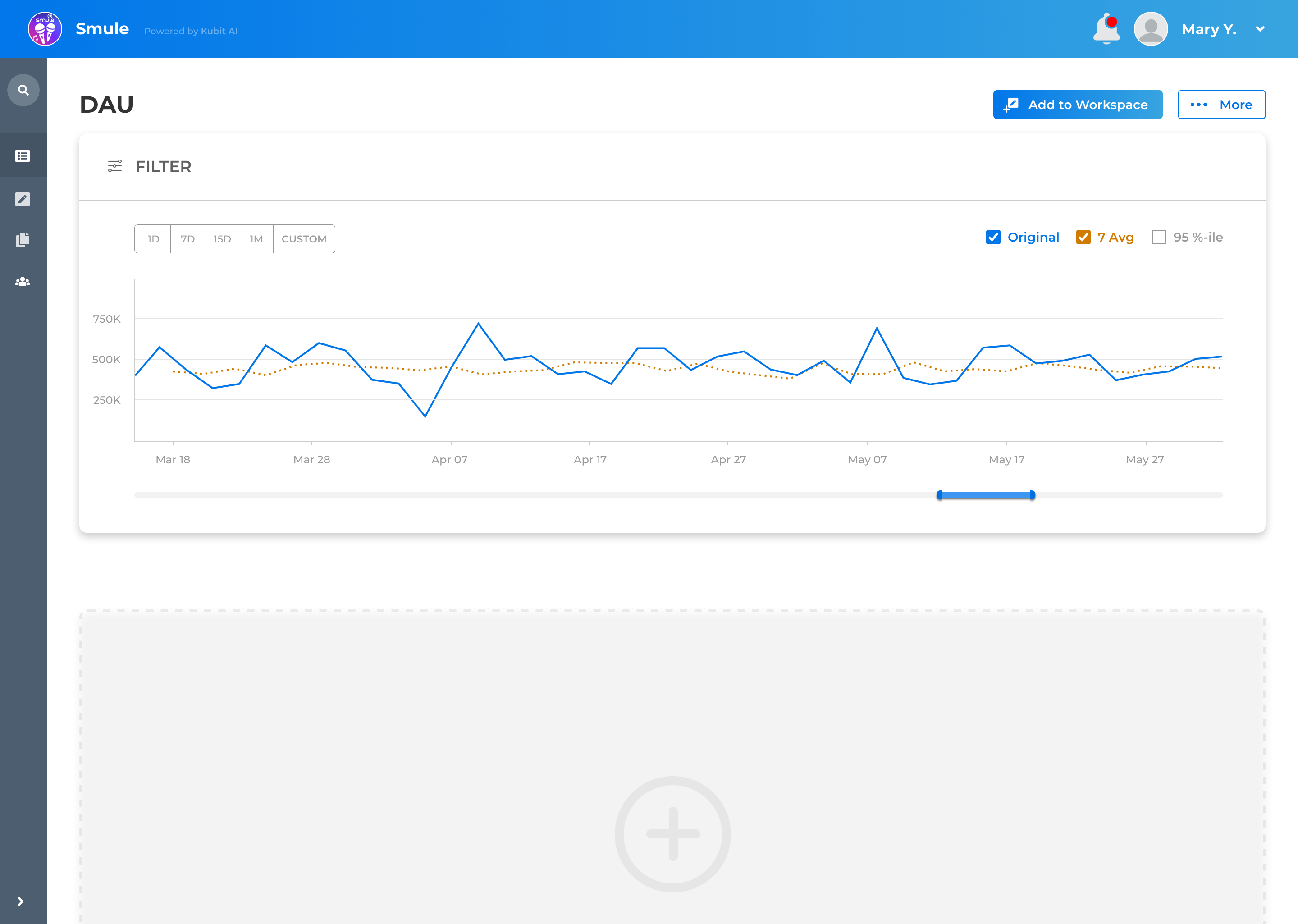
After the PMs found anomalies on chats, all the post-definition communications are done in slack or emails. There are too many emails to keep track with and this is often the case you getting lost through the long email threads and this is no place where the user can view the anomaly topic and previous decisions.
This creates a frustrating and time-consuming user experience. That is why I reached out to the product team and initiated the Analysis UX project.
Diving into the problems
I had a chance to conduct research with the real customers ( interviews), I ask them about the problems they met with the current solutions (Tableau + Slack/Emails) based on their past experience and monitor their behavior on the process of locating the anomalies. I went over their post-definition user emails ( to see what kind of issue topic are they discussing when emailing back and forth) as well as user’s comments on the UX experience of current tools combination (to see which part frustrate them the most) during the interview.
300+ Discussion Emails
7 Interviews


From the findings, I synthesized user needs to be the following:
-
Be able to work anomalies together directly alongside the data.
-
Be able to do some marks within specific charts
-
Minimal work or actions required to finish the entire collaboration process
An Anatomy of the Problem
What's wrong with the current collaboration UX?
To design for a better analyze UX, I dived into Kubit troubleshooting experience to understand the process and problems in every step.
Kubit Diagnose Process


Acquire Domain Knowledge
Even with clear anatomy of the current problem and a sense of UX, when it comes to a real data analytic and diagnose, I still lack relevant domain knowledge to guide me to the most viable solution for every party involved, because the solution will impact the actual working flow in the real world business.
That’s why I actively included customer success team member to learn more about the current process no matter in our platform but also include the other excellent products in the market, which guide me to the user needs and designed a viable solution.

How is the better collaborative UX?
Aligning Needs and Grouping features
Discussing with PM and aligning user needs and business objectives, I did a feature grouping to guide me through the final design solution.
Users Needs
Business Needs
-
A Collaborative function to work out problems together
-
Located the root cause quickly
-
Minimum actions required to get the report
-
Minimum engineer resource required
-
Reduce Manual work for user input
-
Protect Brand Integrity
Design Deliverables


UX Principles
Visual Principles
Confusing UX was one of the major problems in Kubit Analytics journey. Thus, I decided on 3 UX principles to guide me through the design process to create a user flow with high usability.
I wanted to create a visual identity to align the purpose of a seamless collaboration UX - clean, clear and simple. Thus, I created 3 visual principles to guide my design.

Clarity
Guidance
Executability
Deliver an intuitive user flow, with each destination serving a distinct role to eliminate user confusion.
Provide guidance for the user to better archive their goals in case-by-case scenarios.
Allow the user to quickly discover their goals and provide accessible ways for the user to excute on them.

For the design iterations, I stuck with the secondary color with other pops of other colors to offer scalability and clarity.
Montserrat is Kubit's choice that delivers clean, clear readability and hierarchy to the user.
Choose intuitive metaphors and geometric shapes, which matches Kubit's overall styles for icons and style guides.
Design Iterations
At this stage, my primary goal was to make sure the entire flow was easy and comprehensive to the user. Performing usability testing on 7 users, I iterated on design and prototype after I got a new idea of collaboration features.
Implement problems

Fast Prototype Solutions
Revisiting Product Goals
68%
Reduced anomalies related Emails under company account
30%
Reduce the time span of each workspace from creating to archiving